30 June 2010

HAVE A HAPPY BIRTHDAY CANADA! - A SCRAPBOOKING LAYOUT (RED & WHITE)

My response to The Studio (see links) June 16th challenge - "use only the colors of your country's flag (and black)".  Timely for those of us in Canada eh?  Having a Mountie in the family guarantees at least one Canada Day pic - Spencer is always proud to wear the red serge.  (And he wears it well.) 

The white background is Bazzil cardstock, the black is the back of a piece of Core'dinations Whitewash, the red and white patterned papers come from Michael's and the chipboard title from Scrappers' Anonymous (my lss).  The rocket stamp is by See D.

The rocket and flare I embellished with a bit of Gunmetal Stickles and red glitter.  The chipboard (and I love the look of this!) title I used gesso on, let it dry and then faux stitched with a red marker.

TIP #1:  Painting chipboard can be a guessing game - you don't know if it is going to warp until it does!  Then there is no fix.  If you haven't used gesso before you will be amazed at the difference.  Besides doing away with the "warping issue" it gives you a smooth and opaque surface to work with.  You can find gesso in many of the acrylic paint lines for very little $.

TIP #2:  Love the look of white journaling or doodling but haven't found a pen that gives a reliable finish?  Try the opaque white pen from Inkssentials.  It is "the" pen for me and again it isn't an expensive purchase.

TIP #3:  Want to catch up on your papercrafting projects?  Join a challenge!

27 June 2010

TUNNEL O'LOVE - A PLAYTIME SCRAPBOOKING LAYOUT

This is my entry to the June 27th challenge at The Studio (see link).  It's a hot summer day - Mac is a little cranky so the perfect time to get this out for a go.  Kept him busy and happy,  plus he was working those arms and legs to get through the "tunnel".

The background paper is from Daisy Bucket, the grass I cut from a sheet of  Anna Griffin, the tunnel a die cut (trimmed) by Making Memories, the photo corners and journaling spot "Live Out Loud" by Reminisce, the title cut on Cricut using Basic George from Making Memories embossed cardstock which I also used for the photo mats and the brads are from FTI.

SUMMER - A SCRAPBOOKING LAYOUT

Summer, water in the backyard pool and goofing off - a tried and true combination.  Works for Madison and Liam!

Turquoise and organge - I'm sure I've already said that is a favorite combination of mine.  Here the turquoise is a "faux bois" (fancy name for fake wood) pattern from Autumn Leaves - I think I have a tiny bit more in my stash. Here I've used it to represent water - works for me!  The title and year cut using Basic George on my Cricut.  The wave cut was easier than I thought and effective in this case.

DIRT IS MY FRIEND - A SCRAPBOOKING LAYOUT

Of course little ones get dirty all year round but weren't you always more tolerant in the summer?  I'm thinking I enjoyed hosing them off..

When I found this set of acrylic titles - I could hardly wait for a "dirty" picture!

ONE SUMMER DAY - A SCRAPBOOKING LAYOUT (GLITZ DESIGN PAPERS)

Now that summer is officially here (I did say officially) it seems like time for a few summer pages.  What is more summer like than a day in the park.  Tyson, Holly and Madison landed in Victoria for a visit and on this particular day Nanny joined us for visit to the petting zoo and of course sometime in the playground. 

Lots of distressed looks here - I used StazOn inks on the glossy alpha to pop them out a bit, black and red cherry on the flower border.  Three different corner treatments for interest.

24 June 2010

STORIES - A SIBLING SCRAPBOOKING LAYOUT (Dreamstreet Papers)

I've just joined as a follower a fairly new papercrafting challenge blog, check out The Studio Challenges (on my links list).  This is my entry to the World Cup Soccer Challenge - use gold and five of something - representing the "golden goal" and number of penalities each country is allowed to kick.  My "five of something" is the number of brown ribbon stitches on the lower left photo corner and I topped five of the vintage buttons with gold using a Krylon gold leaf pen.

Those of you who peek in here regularly will have seen Mac (McLean) in his walker or other equipment and you might have guessed he has to work hard at the things we take for granted but you  will also recognize that look of delight he so often has in making his discoveries!

This particular picture is an all around favorite.  He was so excited and happy to have a baby sister - if you could hear the chitter/chatter he makes with babies and here is Lucy happily taking it all in.  I can only guess that since this was on his birthday he might be telling her all about it.

I was looking for a more boyish paper to start this layout and found the perfect fit and inspiration here in "Nostalgic-Wistful" from Deam Street Papers.  I framed the 5x7" bw picture with the journaling strips - the plain black and white draws your eyes right to the picture.  All of the punched tiles were done with scraps of core'dinations cardstock, inked with Ginger Bread (VersaMagic), faux stitched with a Stabilo black pen (0.3) and mounted with foam squares though a few I adhered direct to the background for more interest.  I drew a pencil line from top to bottom in from the right hand edge as a starting place and yes, I left the line.

Each tile was topped with a light brown vintage button which I then skimmed over with black Stazon ink (do you think Stazon has an almond/cherry scent too?).  The title was cut using the Winter Woodland Cricut cartridge and a scrap of brown cardstock.  The metal "together" tag is 7gypsies.  I used a bit of brown vintage seam binding to make a link around that bottom corner.

This was fun - I am going to look through my paper stash to see if another pattern inspires a similar treatment!

VINTAGE FRENCH PLAYING CARDS IMAGES

23 June 2010

SHABBY CHIC PENNANT BANNER IN PINK, CREAM AND BLACK

I haven't done a banner in ages - this feels like me and yes I really do have my groove back!  This one is everything shabby I could think of;  lots of layers, pom pom fringe, embossing, inking, Prima Pearls, wired ribbon.

The papers and some of the smaller flowers are "Sabrina" from Making Memories.  The larger flowers I cut with the new Tim Holtz die Tattered Florals - cutting and layering paper, dotted swiss net and more fabric flowers from Prima.

The pennants are embossed in a brocade pattern and then inked in black over the glossy stripes, I love this look.   The letter blocks are layers of grey whitewash cardstock from coredinations, plain pink cardstock which I also embossed using the same folder  and then inked over in pink, almost red and black, a bit more patterned black and white paper punched out and finally the letters rest on a punched out tile of black on black patterned paper from the "Sabrina" line.  I laid out the pennants, adhered the letters and then figured out where the flowers would go, each tile has a bit of Prima Pearl swirl and on each pennant I added punched out dragonflys or butterflys for the final bit!


FISH TALES (FROM A CHILD!) - A SUMMER SCRAPBOOK LAYOUT (The Paper Company)

Now doesn't that make an activist granny proud?  One of our own giving nature a helping hand.  Reports are that Madison loved this field trip and indeed caught and released 20 salmon fry.  Hard to match that great big grin!

I wanted to capture the blues and greens of the landscape and make this look like you are peeking through the trees at the scene.  The background paper is "Secret Garden Blossoms" from The Paper Company, the background cardstock out of the Whitewash line from "core'dinations", and the title and the leaves are from various cardstock scraps - mostly "core'dinations" because I love the finish on their papers.

I picked out three different colors of cardstock for the leaves, sanded the darkest green and used a fresh green ink on the other two for a bit of shading.  I didn't get particular about the kind of leaf I used except I left out the maple die.

I used a Spellbinders die to cut and emboss the leaves - on my Big Shot.  Those of you who know me, know I have been whining for months about how hard it is to figure out the right "sandwich" on the Big Shot for Spellbinder dies.  Mostly I think you haven't expressed your opinion of those comments.  I even bought a 2nd hand Wizard to use instead.  Ok - I had no trouble doing these leaves.  Anyone want to buy a Wizard?

21 June 2010

SMILE - A SCRAPBOOKING SUMMER LAYOUT (Sassafrass)

Isn't today the first day of summer?  What says summer more than the anticipation of the local fair, exhibition, carnival, festival - on and on!  I've almost scrapped the entire album Tyson and Holly gave Bob last year - whew.
Couldn't resist playing with the orange and yellow in the pics.  Main papers are "Anthem" from Sassafrass and the orange dot from My Minds Eye.  Ribbon from my stash, rick rack (LSS), yellow and white baker's twine (MS), alpha and orange button (American Craft), tickets are Tim Holtz.  The journaling frame is the back of a JBS calendar card which I used Distress Inks on.  The butterfly is chipboard from my LSS which I used a white paint dabber on.  A bit of faux stitching with a black Sharpie - one easy and fairly quick page!

20 June 2010

FAMILY PHOTOS - A SCRAPBOOKING LAYOUT (Jenni Bowlin Studios)

I was looking through my stash for blue papers, it was the two school pics of Tiffany and Brandon I thought I was doing today.  I came across the two coral/turquoise patterned JBS and that was it!  Love the bright, bold mix of her papers.  Definitely a two page layout.  Added the two snaps taken at a family wedding in September.  Such a good-looking group! 

The background is from Fancy Pants, the turquoise woodgrain is from Autumn Leaves, the colored cardstocks are my always favorite Co'Ordinations and the charcoal is Bazzil.   The flower, leaves and center bits are all from Making Memories (doodle on the flowers - my own, now that is talent!).  

This is another version of the BG June layout.  The "circle" was cut on Cricut Basic George - 5.5", don't take it off the mat, reload and repeat at 4.5".  Great crescent but this time I used the complete circle.  The title was cut on the same cartridge.  Honestly I started out thinking I would do a big, bold, clean layout which might actually appeal to the two.  My need to rip, tear and shabbify, add more embellishment, ink and faux stitching snuck up on me.  Ok it is my album and hopefully by the time they might be looking through my pages, dividing them up - they will be adults and appreciate my taste?

HOLIDAYS - A SEASONAL SCRAPBOOK LAYOUT USING GRAPHIC 45 RENAISSANCE FAIRE


Catching up means scrapping Christmas in June!  I couldn't resist the lacey, soft greens and reds of Renaissance Faire.  The layout I lifted from the BG June layout of the month (remember to get your money's worth!).  Father Christmas and the tree are diecuts from graphic 45's Christmas Past.  I like the idea of the map on the left page (the "route" you know!) - five 1" strips inked and layered.  A bit of soft green satin ribbon and teeny gold rick rack.  The layered snowflake is K & Company.  The title are chipboard alphas - orignally brown which I treated with alcohol inks in cranberry and gold.  The 'd' is a backwards 'b' and the 'y' started life as an 'x'.  With a little mucking about with your kraft knife those missing letters can usually be recreated!

17 June 2010

A DAY IN THE PARK - A SCRAPBOOKING LAYOUT (Basic Grey and others)


Another take on the Basic Grey layout from May (get your moneys' worth!).  The color palette inspired by the lime and scarlet combination of the BG paper Rhapsody.  I've put this together with another red pattern by BG, a double sided paper (Botanico Garden) from Chatterbox (love the two takes on the lime green), a green polka dot from Chloe's Closet and the flocked dots (?).   The shiny black cardstock is Tuxedo from Bazzil (?)

I cut the title on Cricut using the Simply Sweet cartridge filling in the stencil blocks with a white marker.  The date and stars are cut/punched from a JBS calendar card, the name labels are Scenic Route (don't you miss them?), the tickets are Tim Holtz and I finished with a big line of jumbo white ric rac!


16 June 2010

PORPOISE BAY (DINNER, DESSERT AND A VIEW) - A SCRAPBOOKING LAYOUT (Basic Grey)


Catching up on last summers' pictures - more to come!  It was our 33rd anniversary while we were sitting Mac and Lucy - for a break (wow did we need one!) Allison and Spencer arranged for a night out with a sitter.  We had a nice dinner overloooking the marina at Porpoise Bay. 

Patterned paper is Basic Grey "kioshi", blue and pink are Making Memories, cardstock is Co'Ordinations.  The flowers are an assortment of glittered chipboard and paper, a few sprigs of pink Prima pearls and antique pearl centers from Melissa Francis.  The title is "stick with it" alphas and Crushed Velvet flock from doodlebug design.  The metal embellishments are also Making Memories.

15 June 2010

LET'S FIX IT - A SCRAPBOOKING LAYOUT (Sassafrass)

This was fun to work on!  I've been saving the Sassafrass papers for just the right pictures.  Grandpa is the fix it man and usually has a list of chores to keep him busy.  Of course the kids want to help and he came prepared.  The blue, red and black papers are mix of cardstocks, the green felt border is fromm Kaiser, the mini buttons American Craft and all else is from the Anthem line by Sassafrass.  I mounted both pages on black cardstock showing only on the outside, top and bottom to frame and connect the two pages. 

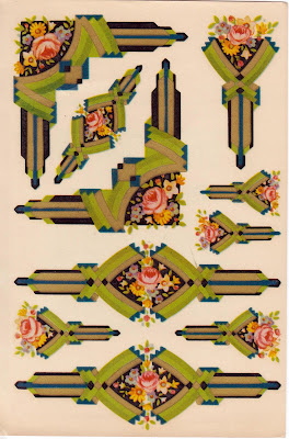
ART DECO CORNERS, POSTS AND BARS - A VINTAGE IMAGE

Well I'm home and thrilled to post for you this set of 1939 Art Deco Transfers!   Bob found these last week at a local show, I could hardly wait to share with you.  Hope you have fun with these and creative something really beautiful.  The original sheet is 5.5 x 8 inches.  Remember to click on the image and save that for the best resolution.  Enjoy!

9 June 2010

A BABY SCRAPBOOKING LAYOUT - BACKYARD FUN (Basic Grey)

The Basic Grey Layout of the Month kit supplies are very generous.  Here is another one page layout using mostly the same supplies.  Just a word about posting pictures of children.  I always think about the titles I post and try to keep identifying remarks somewhat generic.  I recently attended a conference on Missing and Exploited Children (work related) it was a good reminder to take care and give thought to how and what you post and to share that with you.   

8 June 2010

WHO'S LOOKING AT ME? - A BABY SCRAPBOOKING LAYOUT (BASIC GREY)

Another take on the Green At Heart  layout for May, the background on this one is from the BG Origins paper line.  This one is 2009 so they won't be near each other once I put them in albums.  I have about 60 layouts that need to go into albums - is it just me or does everyone do that? 

LET YOUR LIGHT SHINE - A GRADUATION SCRAPBOOKING LAYOUT


My take on Basic Greys' Layout of the Month using their new paper line Green at Heart.  This is Allisons'  graduation from the University of Victoria.  It is always so hard to decide what pictures when it is an event and so many are taken!  By cutting some pictures into 2x2  inch squares this layout captures 7 different views - immediate family, best friend and accepting the diploma!  Yes that is me with the fushia hair.   This was 2001 and not a common sight - didn't know how much moxie I had until then.
Photobucket